SwiftUI Layout Containers
HStack
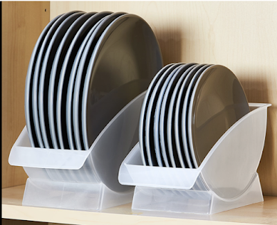
you can refer HStack as a horizontal stack. You want to stack your controls shown in the image below.
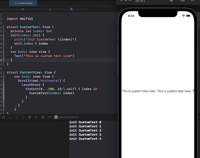
As the name says this is a Lazy container. As the keyword, Lazy in a programming language is a strategy to delay the initialization until it is needed. The views in the LazyStack are not initialized until they are needed.
You can try this code and see how it works.
import SwiftUI
struct CustomText: View {
private let index: Int
init(index: Int) {
print("init CustomText \(index)")
self.index = index
}
var body: some View {
Text("This is custom text view")
}
}
struct ContentView: View {
var body: some View {
ScrollView(.horizontal) {
LazyHStack {
ForEach(0...100, id:\.self) { index in
CustomText(index: index)
}
}
}
}
}
It should look like as shown in image below when you first run it.
VStack
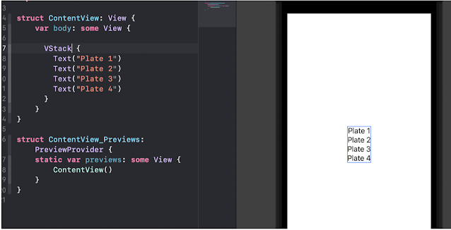
The Stack is referred to as vertical stack e.g. as shown in the image below
The corresponding SwiftUI views are stacked in a similar fashion as shown in the image below.
LazyVStack
LazyVStack works very similar to LazyHStack, it's just that it will align the items vertically. Before you read further, I want you to try the code from the LazyHStack section and just change the LazyHStack to LazyVStack.
Check the output in the debug window. Must be wondering what is going on there. All the items are getting rendered.
So what should you do it fix it? Try it before looking at the code below.
|
|
|
I am sure you have tried it. The thing is that you need to change the ScrollView to be .vertical.
import SwiftUI
struct CustomText: View {
private let index: Int
init(index: Int) {
print("init CustomText \(index)")
self.index = index
}
var body: some View {
Text("This is custom text view")
}
}
struct ContentView: View {
var body: some View {
ScrollView(.vertical) {
LazyVStack(alignment: .center, spacing: 50) {
ForEach(0...100, id:\.self) { index in
CustomText(index: index)
}
}
}
}
}
Spacer
As the name suggests Spacer control takes the remaining space in the view. Spacer takes the remaining amount and if you have multiple spacers the remaining space will be divided equally among different spacers. e.g. as shown in the image below with VStack
The spacer works in a similar way in HStack as well.
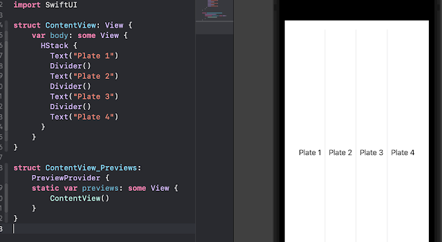
Divider
LazyHGrid
import SwiftUI
struct CustomText: View {
private let index: Int
init(index: Int) {
print("init CustomText \(index)")
self.index = index
}
var body: some View {
Text("This is custom text view \(index)")
}
}
struct ContentView: View {
var rows: [GridItem] = Array(repeating: .init(.fixed(20), spacing: 5, alignment: .center), count: 3)
var body: some View {
ScrollView(.horizontal) {
LazyHGrid(rows: rows, alignment: .top) {
ForEach(0...100, id:\.self) { index in
CustomText(index: index)
//Text("This is sample")
}
}
}
}
}
LazyVGrid
Columns are vertical in the Grid and this is a VGrid and we need to define columns definition for this grid.
Let's change the minimum required code in the LazyHGrid section code to make it work for LazyVGrid.
Use the below code and run it. Check the output and try to understand the rendering,
import SwiftUI
struct CustomText: View {
private let index: Int
init(index: Int) {
print("init CustomText \(index)")
self.index = index
}
var body: some View {
Text("This is custom text view \(index)")
}
}
struct ContentView: View {
var columns: [GridItem] = Array(repeating: .init(.fixed(20), spacing: 5, alignment: .center), count: 2)
var body: some View {
ScrollView(.vertical) {
LazyVGrid(columns: columns, alignment: .leading) {
ForEach(0...100, id:\.self) { index in
CustomText(index: index)
//Text("This is sample")
}
}
}
}
}
Now change the grid item to be .flexible() and see the output. Try playing with column counts and uncomment the Text view and see the output and try to understand how the rendering is happening and play with the code. If you have any questions leave them in the comments.
GridItem
We are using GridItem to define the Rows and Columns definition for the Grid. It has different properties that we can define when we initialize it as Size, Spacing, and Alignment.


No comments:
Post a Comment